

How many people live on Earth? And how many of them live in different areas of the world? Understanding how human population is spread out across the globe is important to understand the planet’s supply and demand for natural resources.

Spatial data of human population distribution is important to understand the climate change and its impact, and for the better management and distribution of natural resources like freshwater, food products etc.
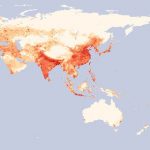
This map shows how many people live in different areas on Earth. The map is divided into numerous small boxes, called “grids.” Each grid box is 1×1 sq km, and it is color coded to show how many people live there.

Lighter areas have fewer people. Red dots scattered across most countries show cities, where many people live in a small area. The map is based on census data available in 2000 and uses estimates when necessary to fill in missing or incomplete data.


Comments are closed.